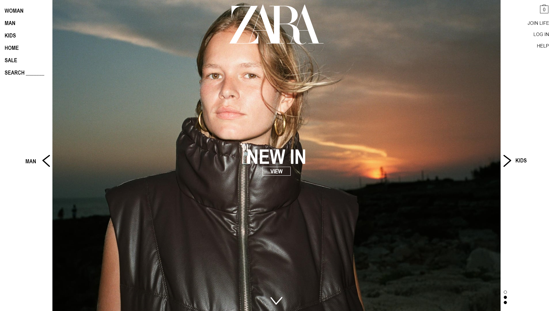
In 2020, everyone was forced to become more reliant on online shopping. It went from being a pleasant convenience, to a modern necessity. Because of this, I had noticed more and more people criticising the ZARA website and app. It had become a common joke to mention their negative experience with it, and I decided I wanted to find out exactly why people were feeling this way, and what the ZARA customers really wanted.
Next, I conducted usability testing. The most frequent negative comments were:
The most frequent positive comments were:
To tackle the overwhelming slurry of menu options, I asked the users to do some card sorting. I wanted to find out how users would structure the central navigation on ZARA.
The sorting activity led to the following categories. They're simpler and cleaner; with less focus on specificity allowing more room for user error.
I created a series of user personas to guide the design process. Personas help to define what a user's goals are and what their needs might be:
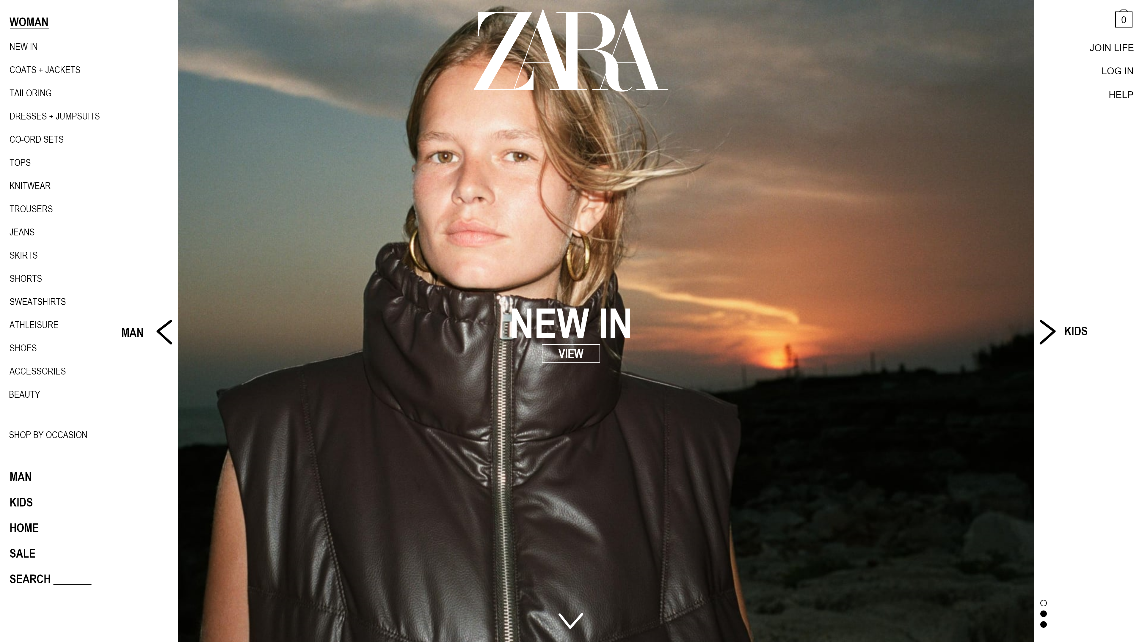
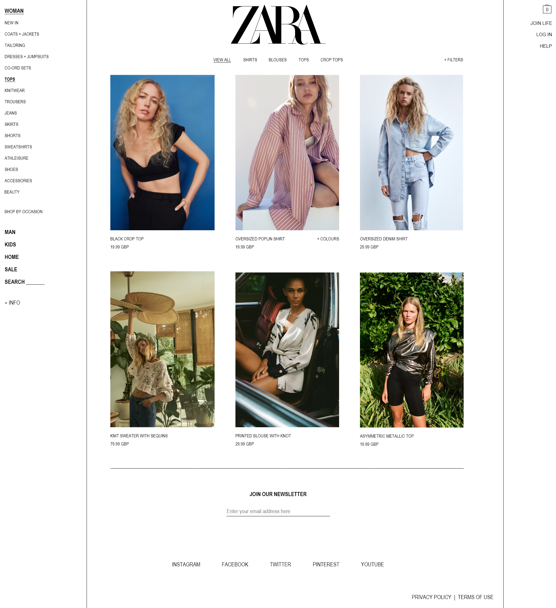
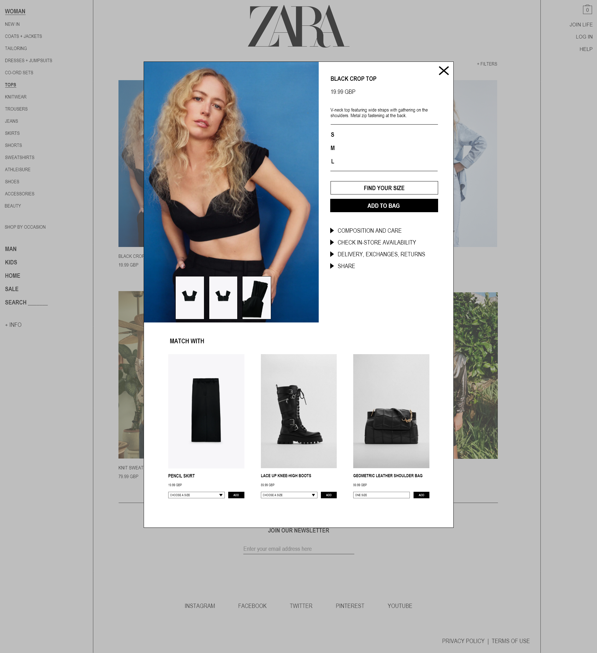
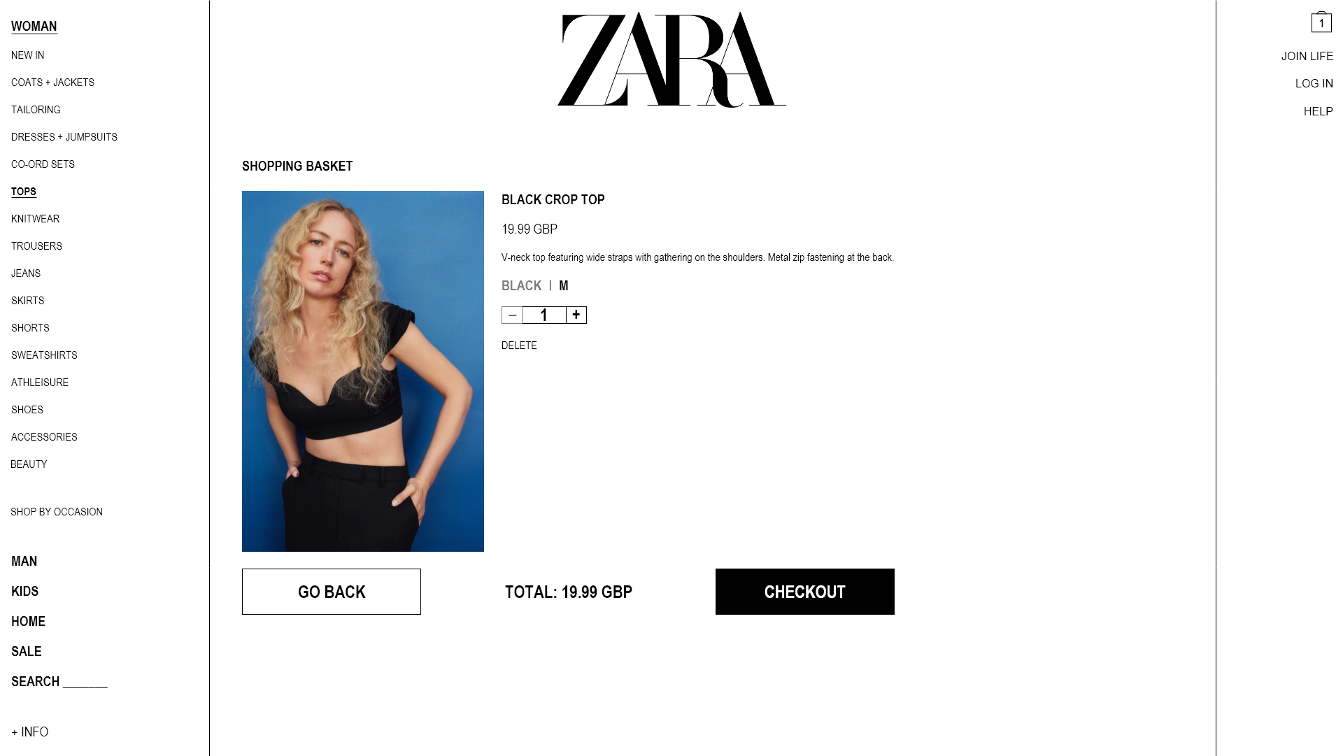
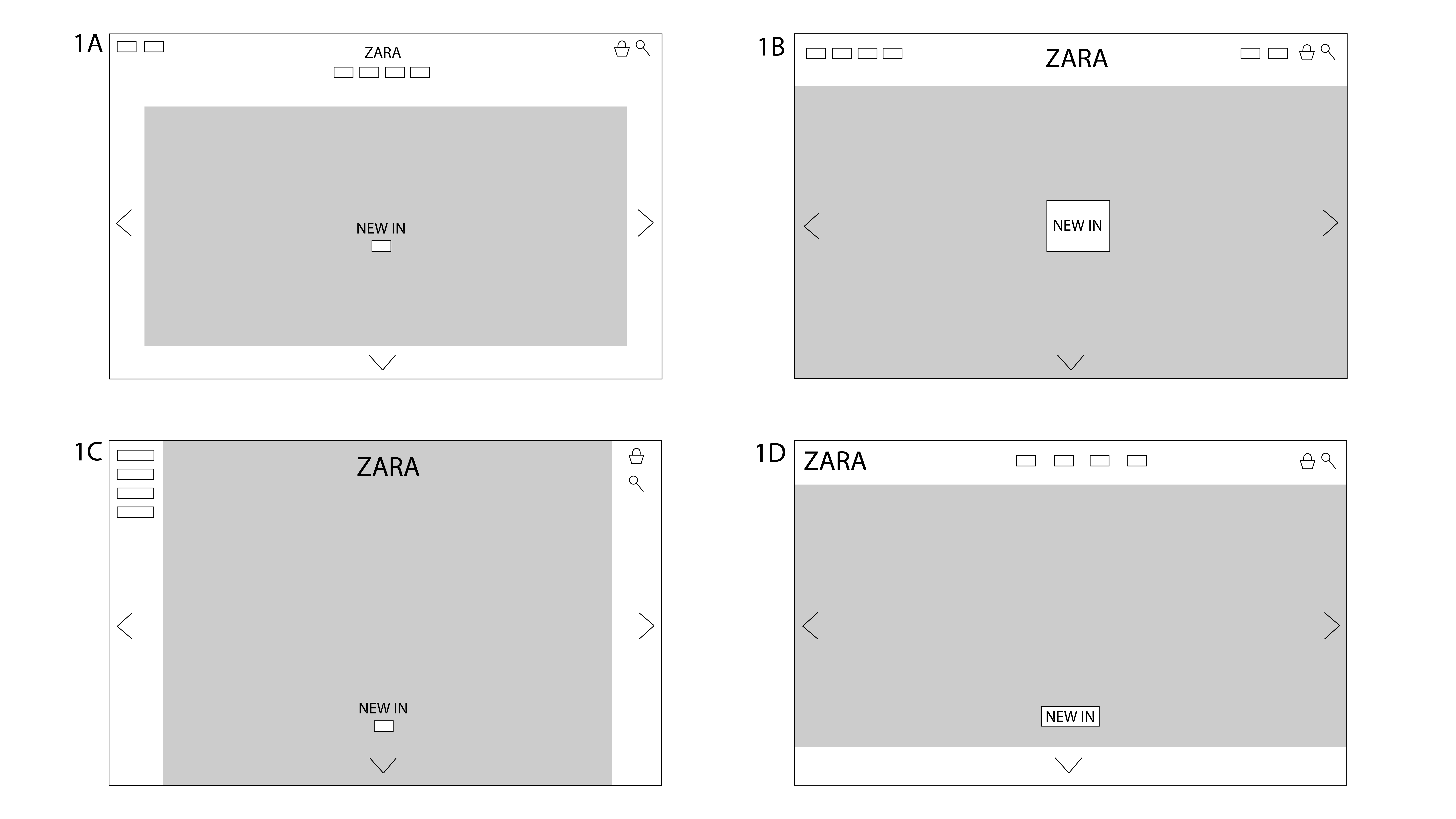
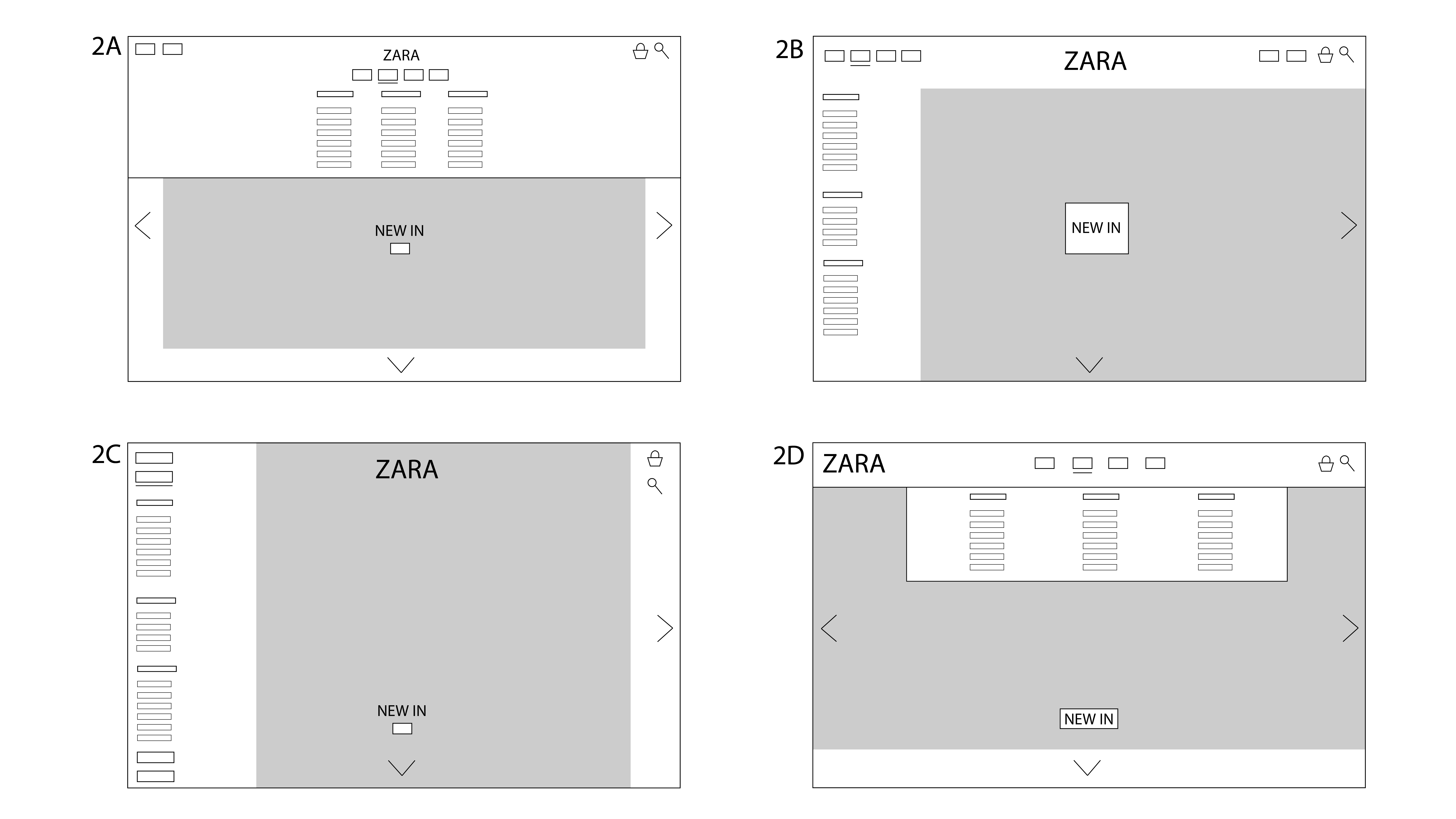
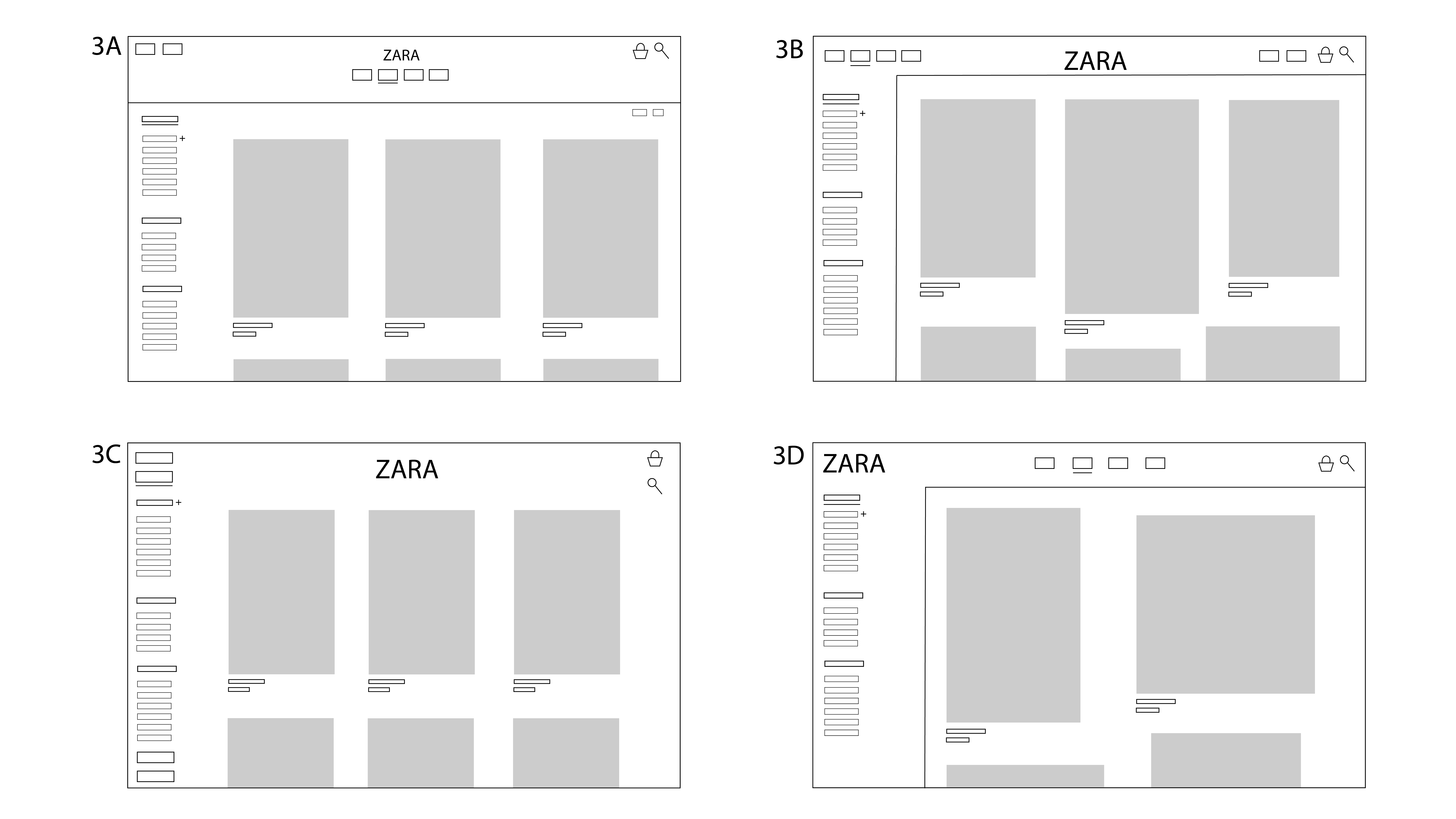
Finally, I sketched out some low-fidelity prototypes:
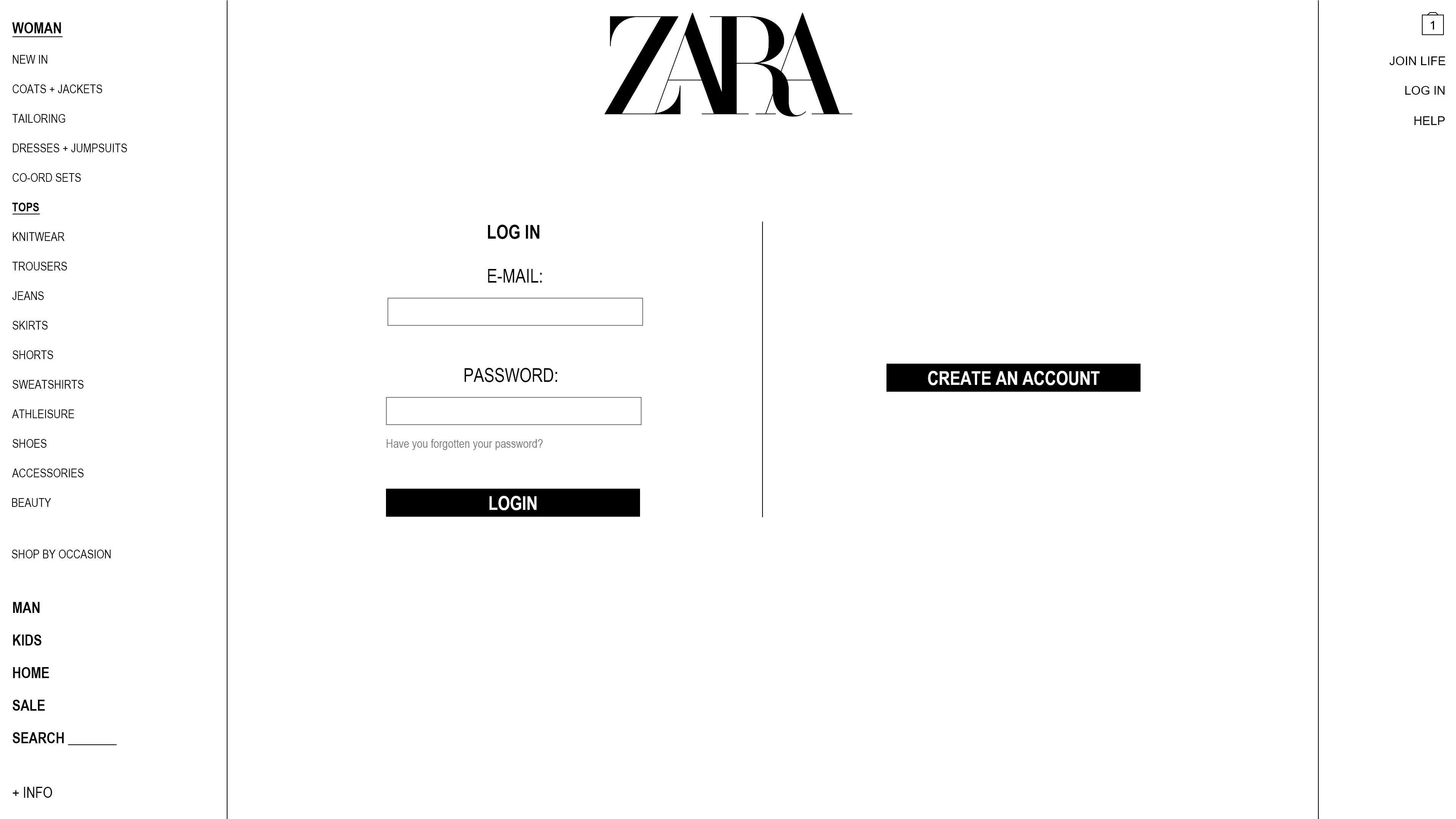
After getting feedback on the designs, I developed the most favourable ones into high-fidelity prototypes: