It was the ideal structure for this design system and it's helped to make it clear, structured and accessible.
Shortly after I joined the design team at Unissu, I was tasked with taking ownership of the build and management of their design system, Navarro.
The Navarro Design System is Unissu's collection of reusable components, the single source of truth for the design team when developing a product.
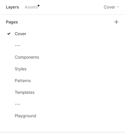
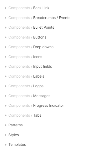
I began with conducting research on how to structure the design system. Before putting any content in, I needed to know where to start and how best to structure the project. I chose to use the Atomic Design methodology by Brad Frost, because it has an explicit order and hierarchy which simplifies entire interfaces into a set of elements.
It was the ideal structure for this design system and it's helped to make it clear, structured and accessible.

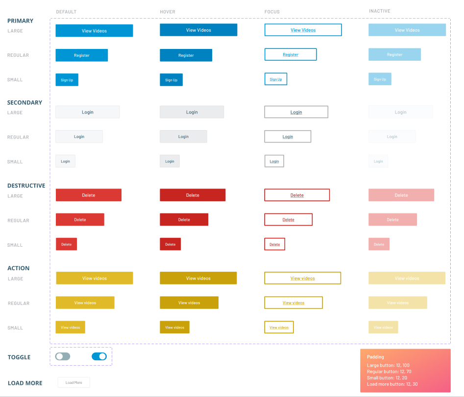
I started with the "atoms". These are elements that can’t be broken down any further, such as buttons, icons and labels. I went through all of our design files and destructured the elements on our platform, then organised the atoms using a naming convention that would arrange them clearly in Figma's Assets panel, where all of the components are found.
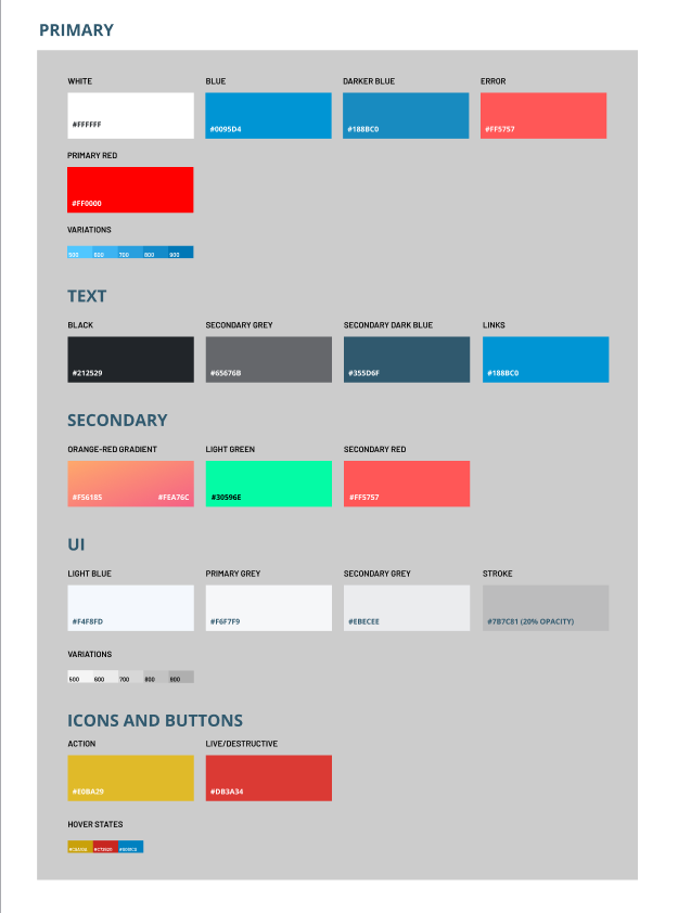
I also included visual documentation of styles; this includes Colours, typography, images, illustrations, and elevations. Despite Figma having reusable "styles", which can be accessed from a team library, I decided that a visual documentation of this would be useful, for example if the company ever move away from Figma, or for onboarding new members.
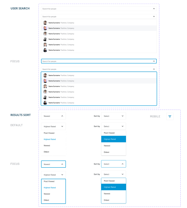
The patterns page holds the molecules and organisms of the system. These are groups of the “atom” elements that function together, such as navigations and sidebars. For a design system of this size, it was beneficial to combine them onto one page that I call patterns, since it limits the need to search through several pages.
The templates show all of the components working together on a page. It is the skeleton of the pages that we see on the platform, as they hold no content. It lets us focus on the structure, allowing the bigger picture to be formed out of smaller components
To make the design system accessible, I created a Playground page, it's a space for the team to learn the assets, find out how best to use them and engage in the discussion behind how the components were thought out.
To make onboarding to our team easier, I also created a presentation that introduces the design system to its users. My goal is to keep this system evergreen, and ever useful to the designers and developers. So far, it has saved the designers a lot of time when making iterations and kept everyone organised; it narrows the margin for error and keeps us consistent.