Like any designer, I like to keep up with UI trends online, whether that’s on Instagram, Dribbble, Pinterest, etc. What I had noticed recently was the same old style being repeated over and over; either all very flat, or exaggerated glassmorphism. Trends like this completely take over social media (not just when it comes to UI design), but they fall off just as quickly as they appear, to make room for a new trend. I was interested in designing something slightly different, still trendy, still belonging in the digital space we are used to, but a little more experimental.
I decided to combine various features of these trends that make the visuals modern and appealing. The features that keep coming back because of the positive user experience that they give (such as the classic iOS “squircle”). Combined with the trendy “glowyness” of glassmorphism, a space-themed app seemed ideal.
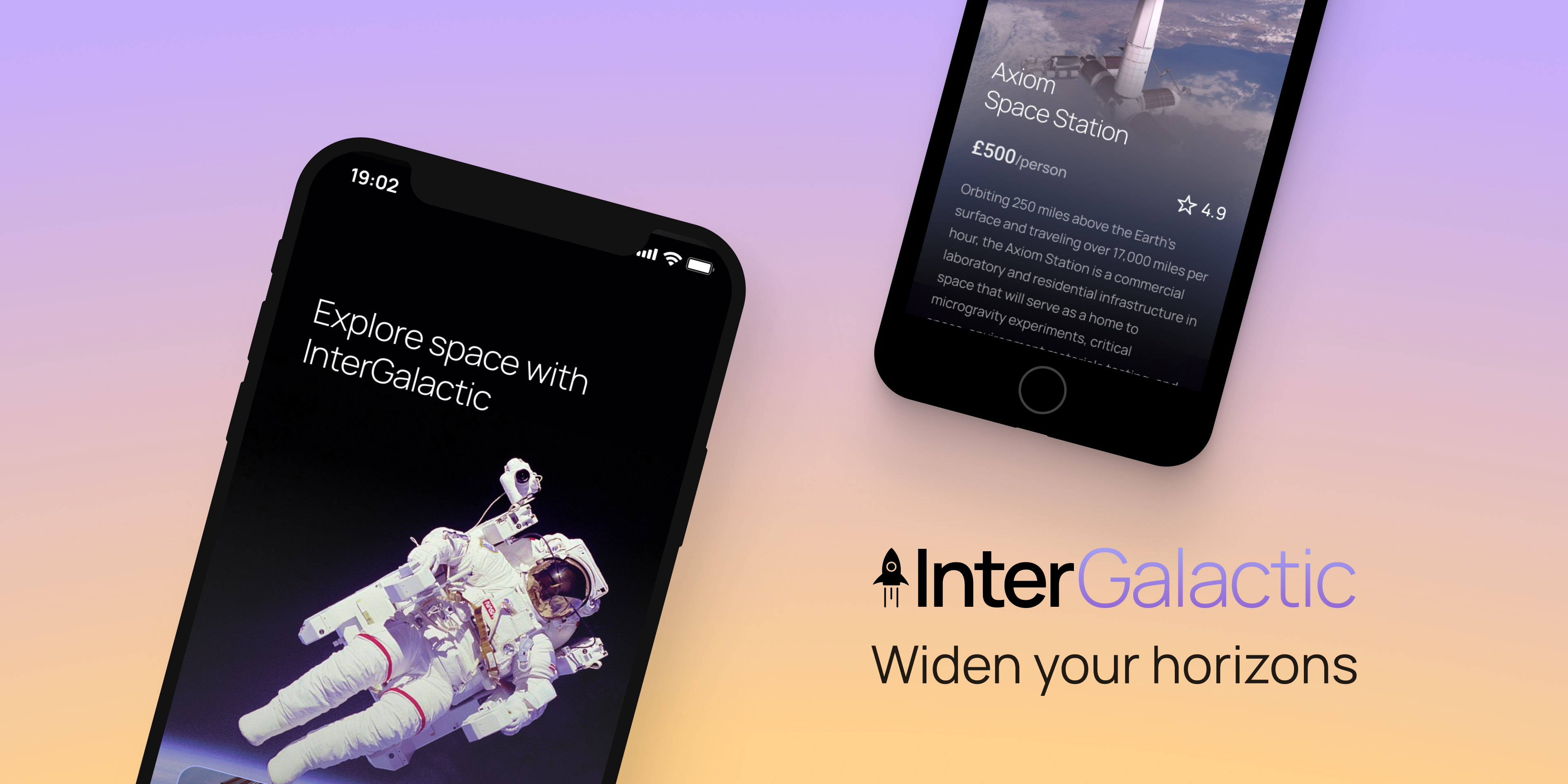
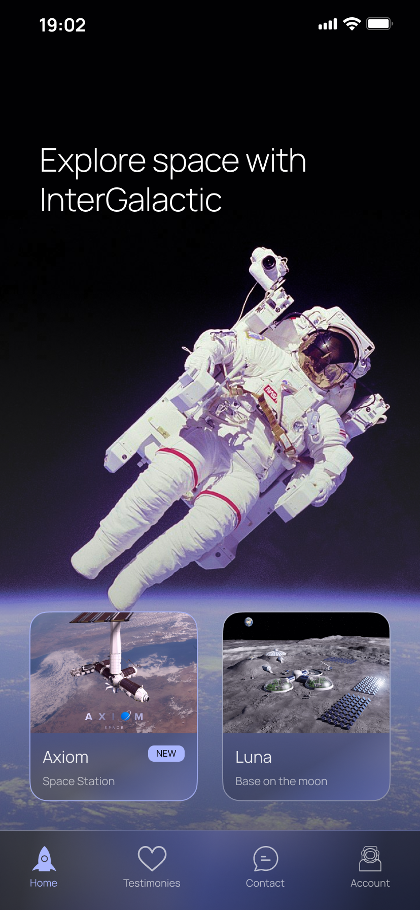
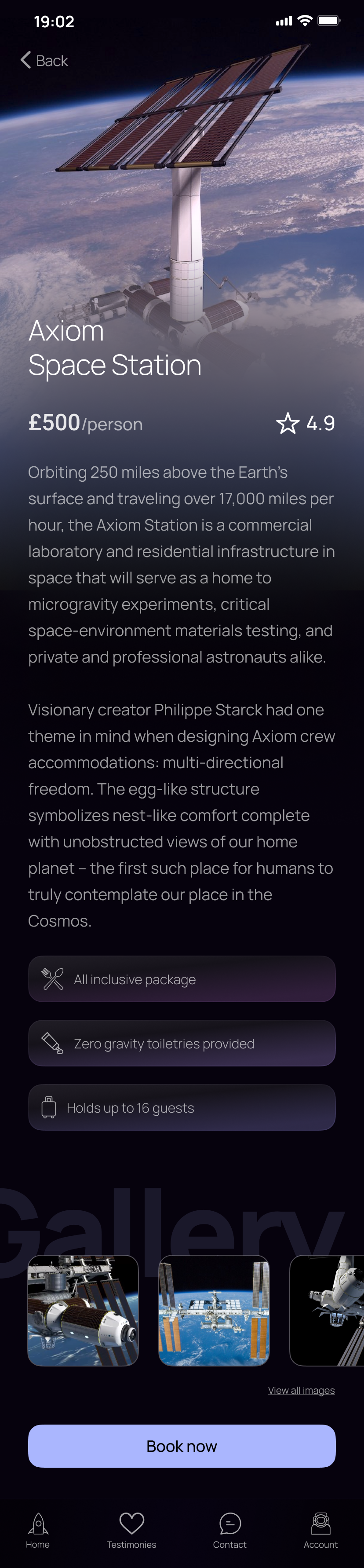
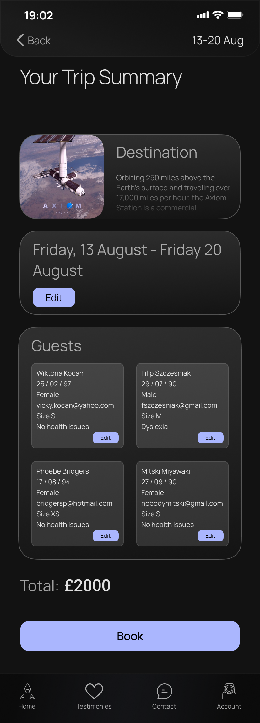
Space travel is starting to become a reality for people that aren’t brilliant scientists. I’m sure everyone has seen the movements humanity is making towards exploring space. So, who knows, maybe in 10, 20 years, we’ll have access to an app that lets us book such a trip. Along comes InterGalactic!
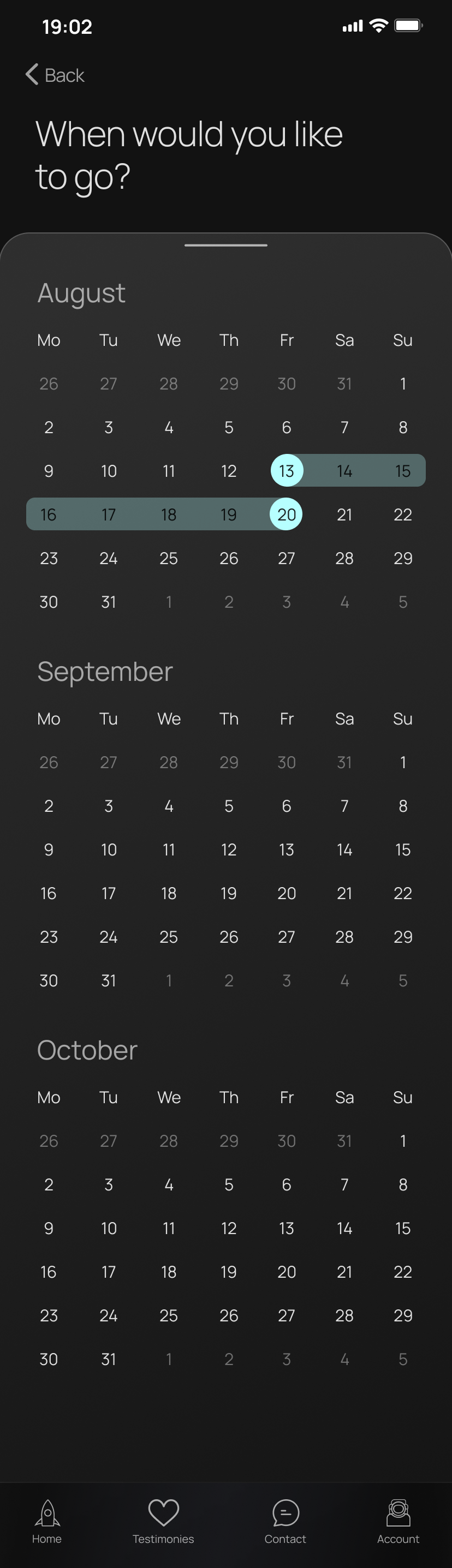
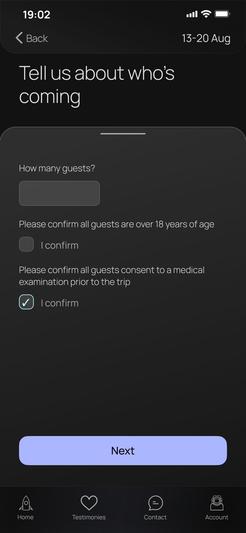
After some initial research into what an ideal user journey is when booking a trip online (taking inspiration from the greats, such as AirBnB and Trainline), I created my sketches into simple wireframes. I presented these to about 10 people and took user observations for the purpose of usability testing. Once I was sure the journey was clear and user learnability was quick, I knew I could move on to the next stage.
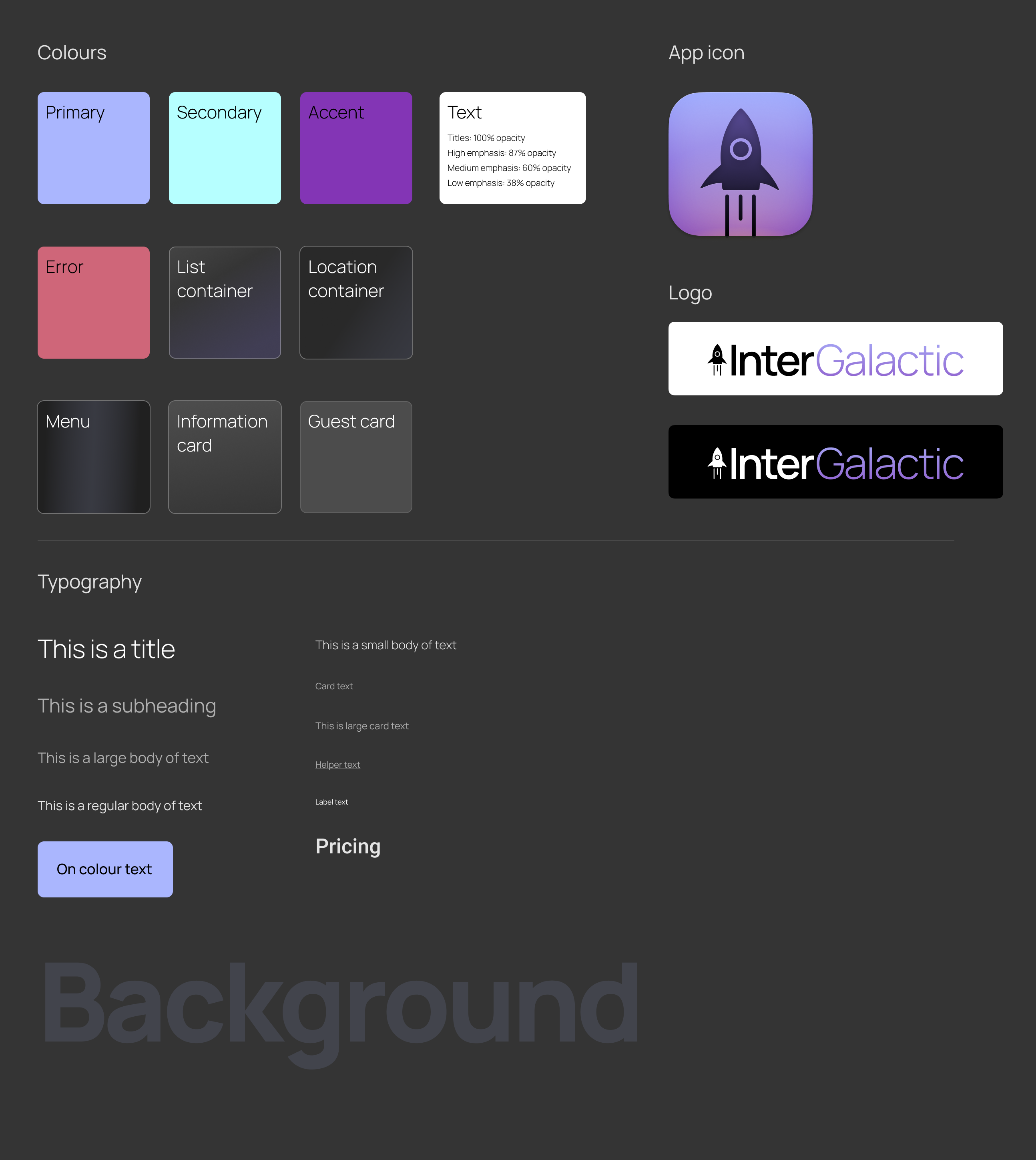
I specifically chose a space themed app because I associate space with glowy aesthetics, organic shapes, and something I haven’t focused on before – a dark theme. When creating the components, I kept in mind a lot of the guidelines from Material.io. Since I was designing for iOS, I wanted the app to fit seamlessly into it.
As well as prioritising general usability (such as taking colour-blindness into consideration when choosing active/non-active icons), I made sure my design passed the Web Content Accessibility Guidelines. Material.io does a great job at explaining how to make dark mode designs, and I found it extremely helpful, especially when picking colours that gave an intergalactic glow without hurting anyone’s eyes.
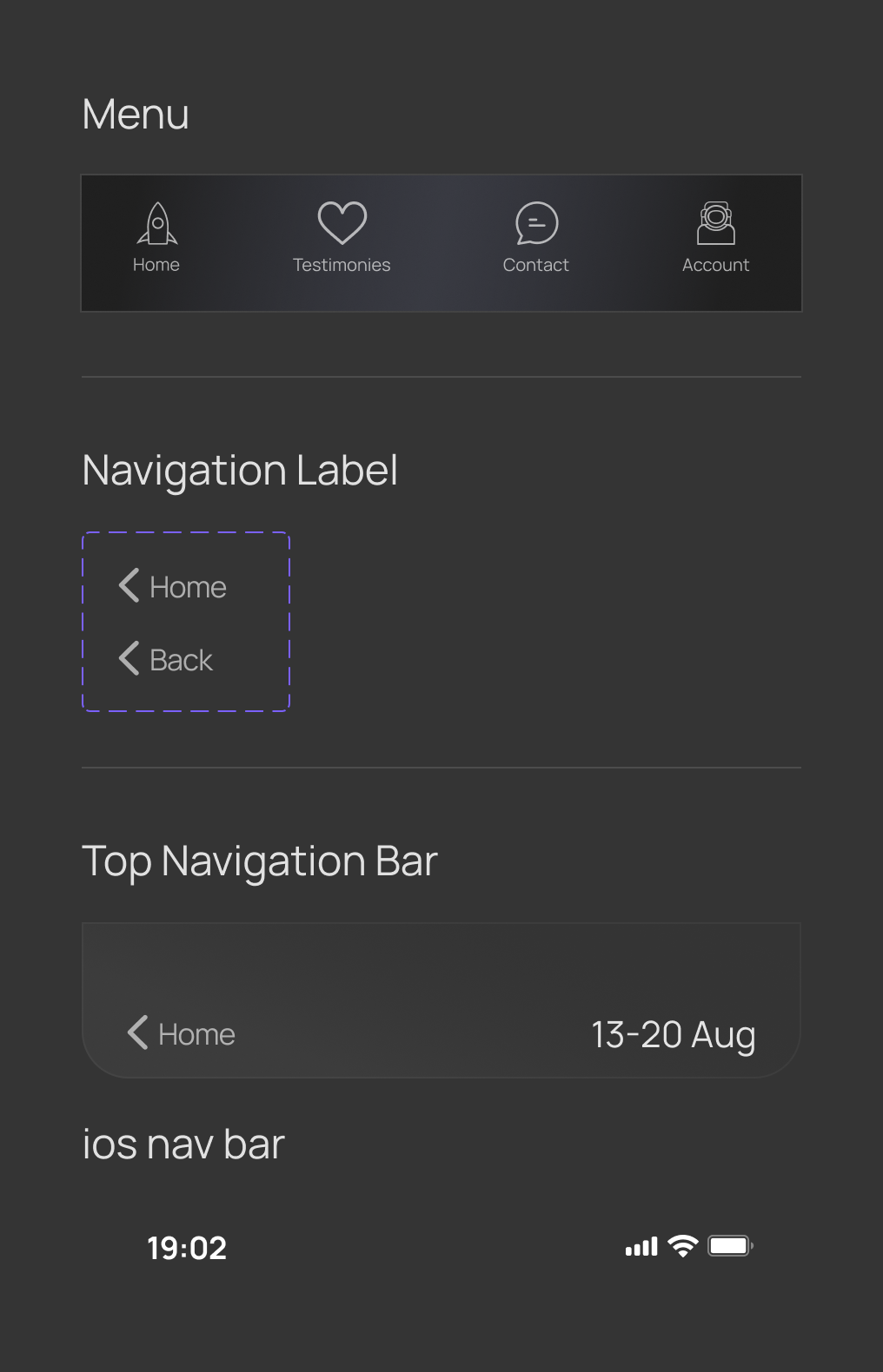
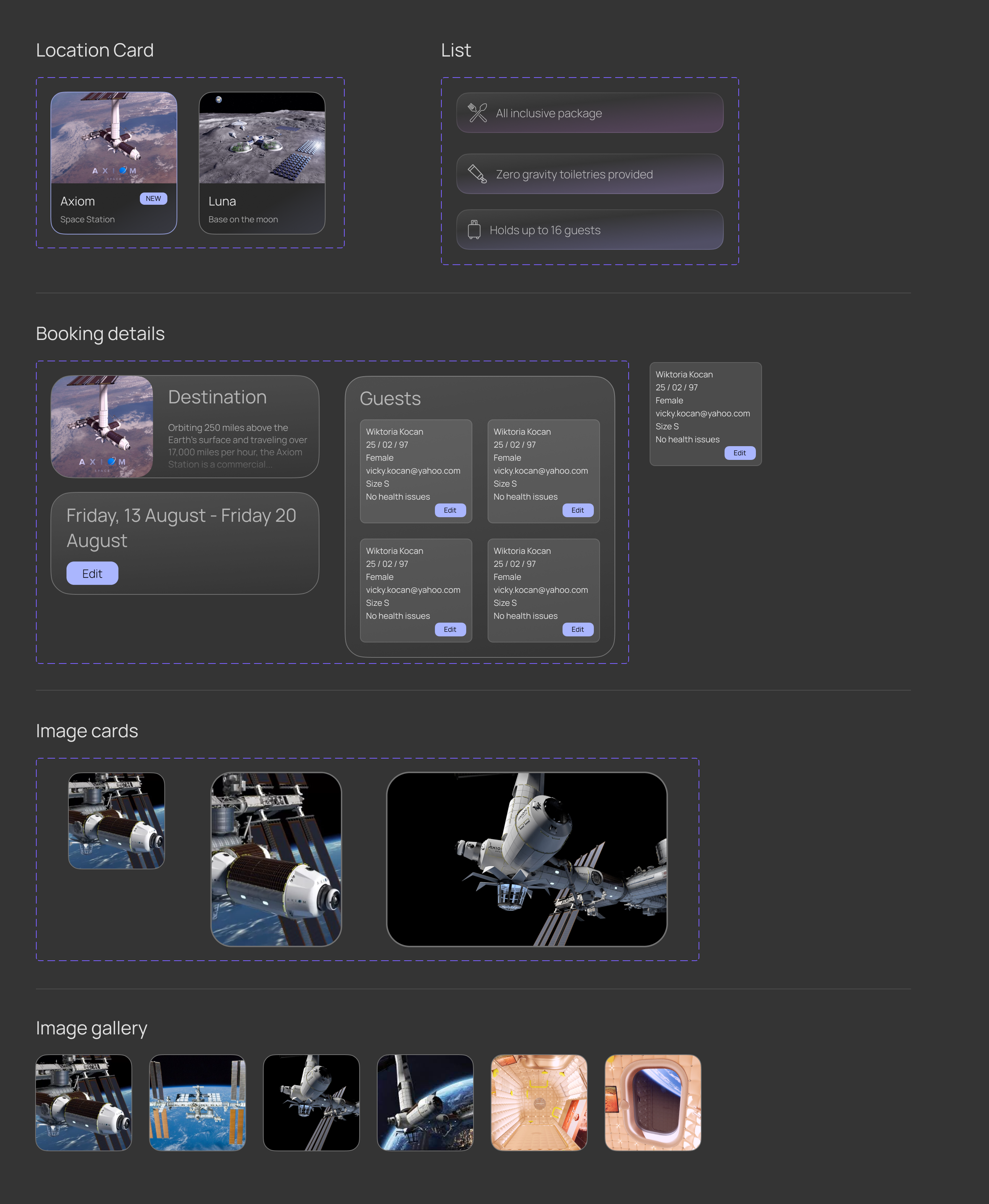
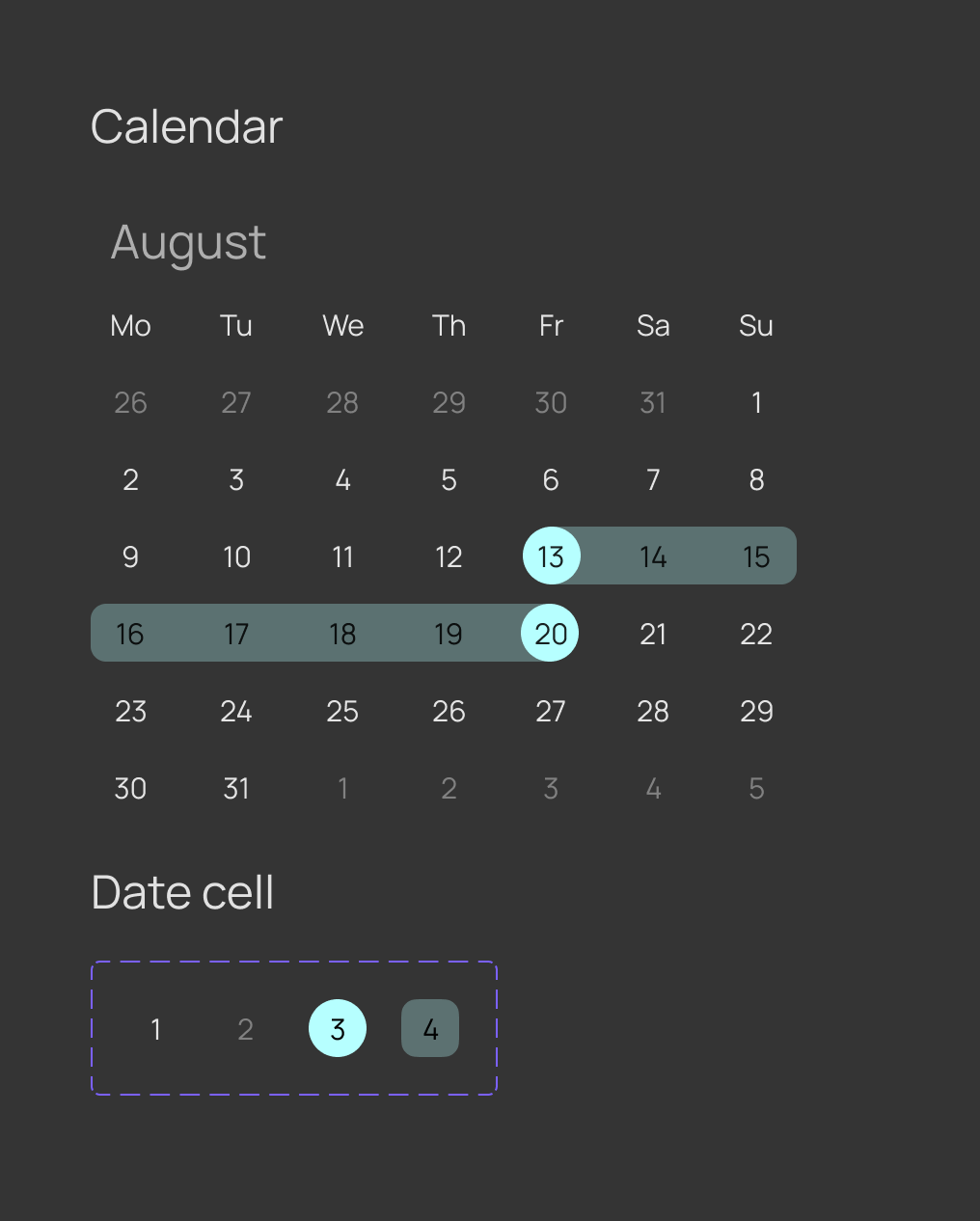
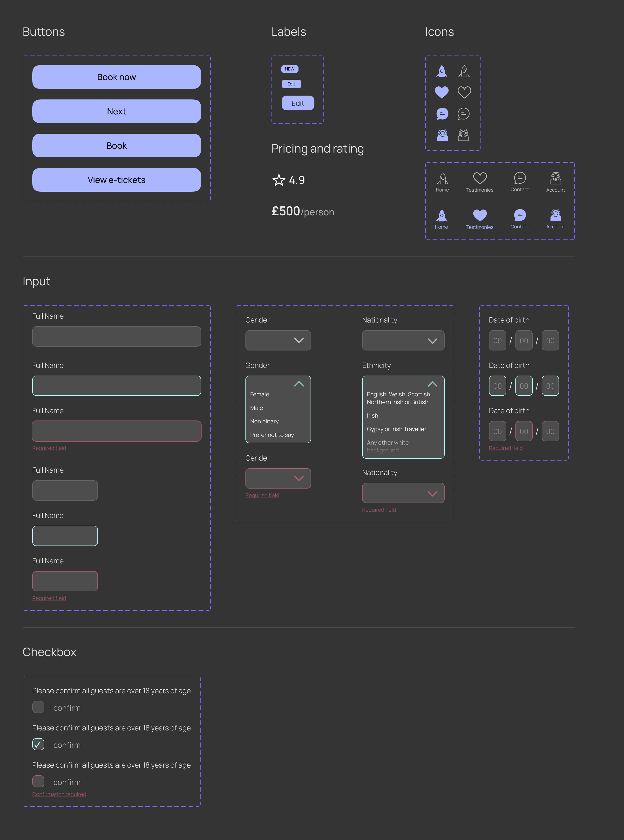
Of course, I also created a design system. Ever since creating the Navarro Design System, I’ve adored documenting and organising my designs. I learn something new every time I do it, and I find it extremely satisfying to pull components out of a library and switch from an active state to an error state so easily. There’s so many other cool stuff you can do with components and libraries, and I enjoy learning more about it every day.
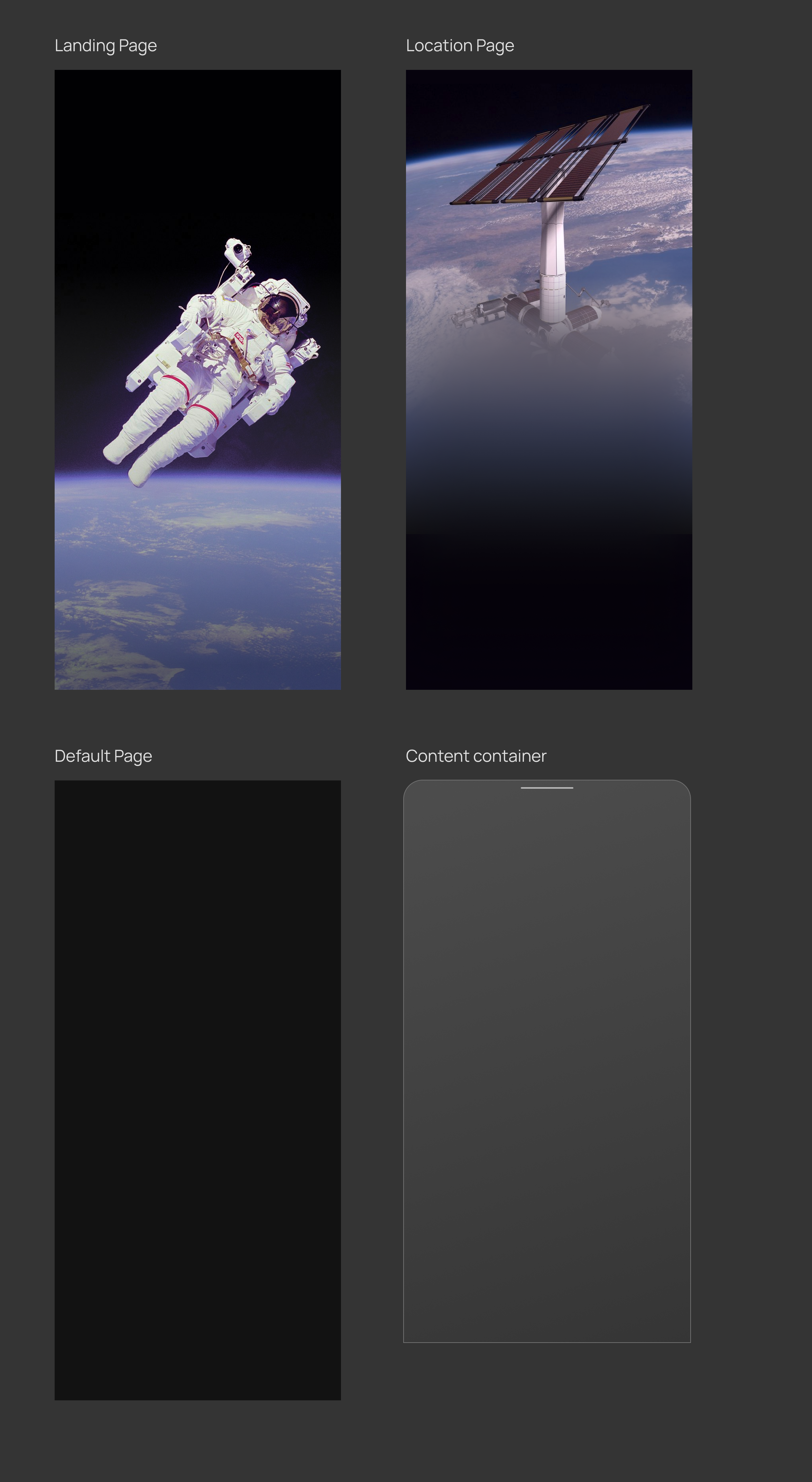
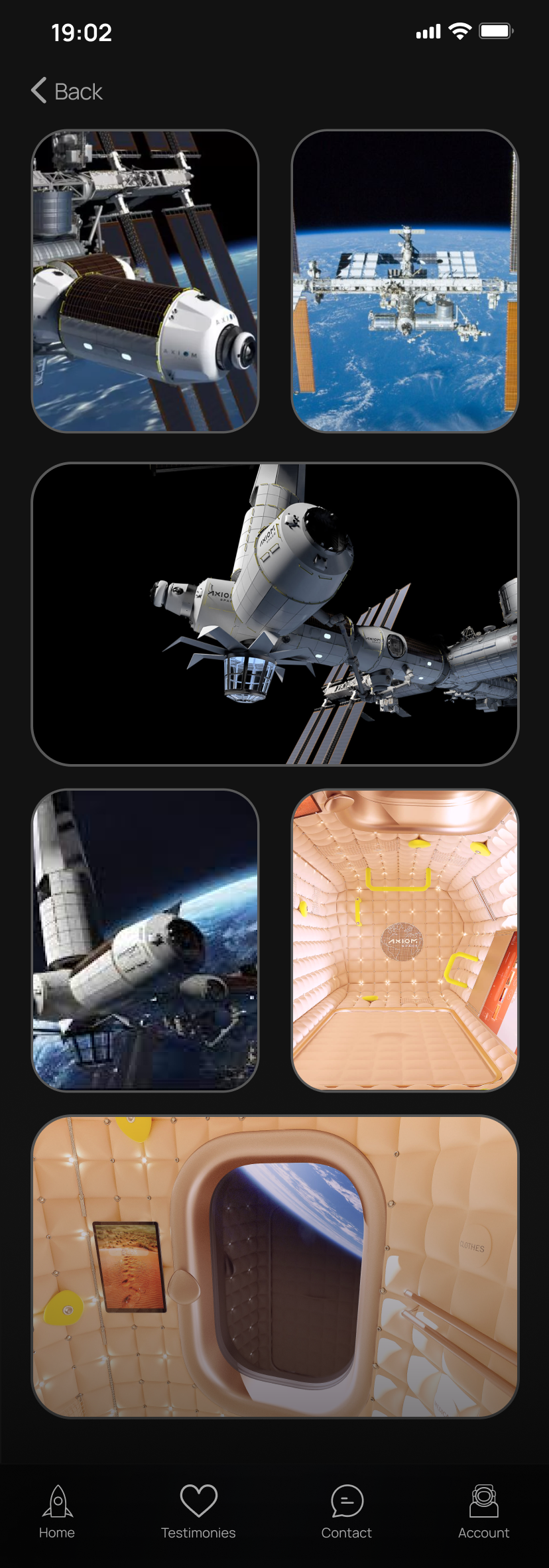
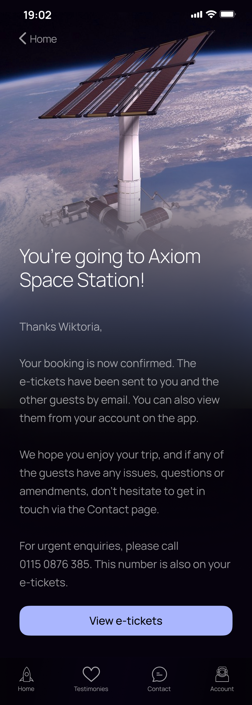
Lastly, I wanted to make my app feel real. Adding interactions lifts the design into another level, where it’s not just a pretty picture, but a product. I created the journey of booking a trip to the Axiom Space Station. There is a link to this interactive experience at the bottom of the page, if you’d like to imagine having the ability to be an (almost) astronaut.