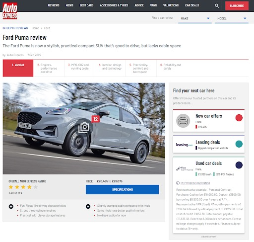

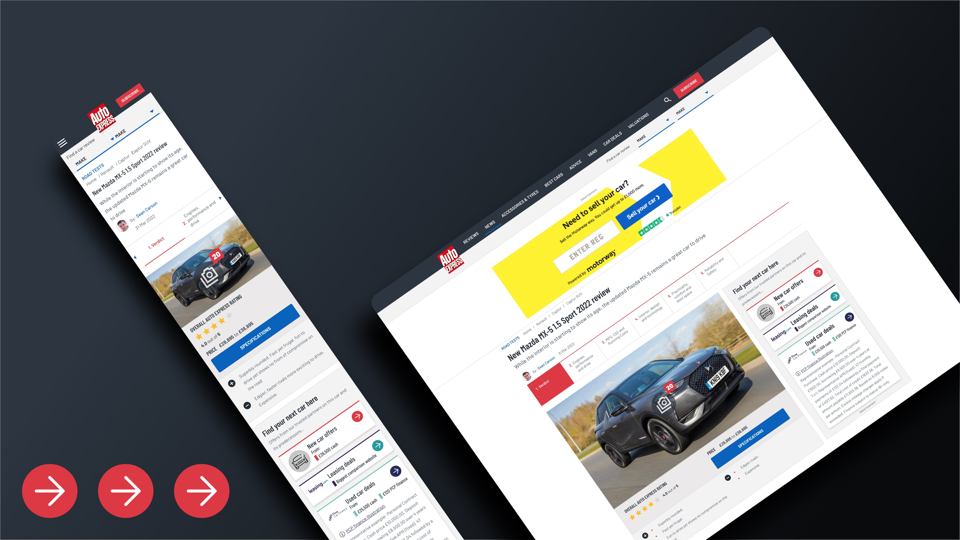
We needed to build a new flow for users to convert with our prospecting partners and to provide them with high value pricing information, without them having to navigate to other sites. Thus, came the idea of the Buy Box. We had a proposed commitment that all reviews and specific make/model articles will host a considered block of buying CTA's, clearly signposted to the user for New, Used and Leasing prices. This buy box would strike a balance of Auto Express branding, to ensure trust of the user, while also hosting clearly external brands.
The container itself followed our design system, allowed us to introduce the brands with some short copy, and hosted the three external new, leasing and used containers. The font for all of these was also ours, to avoid having the reader “adjust” to various different fonts, and to not be dismissed as an advert. However, to keep the links clearly external, logos are included as well as the individual brand colours as “accents” on their individual containers.
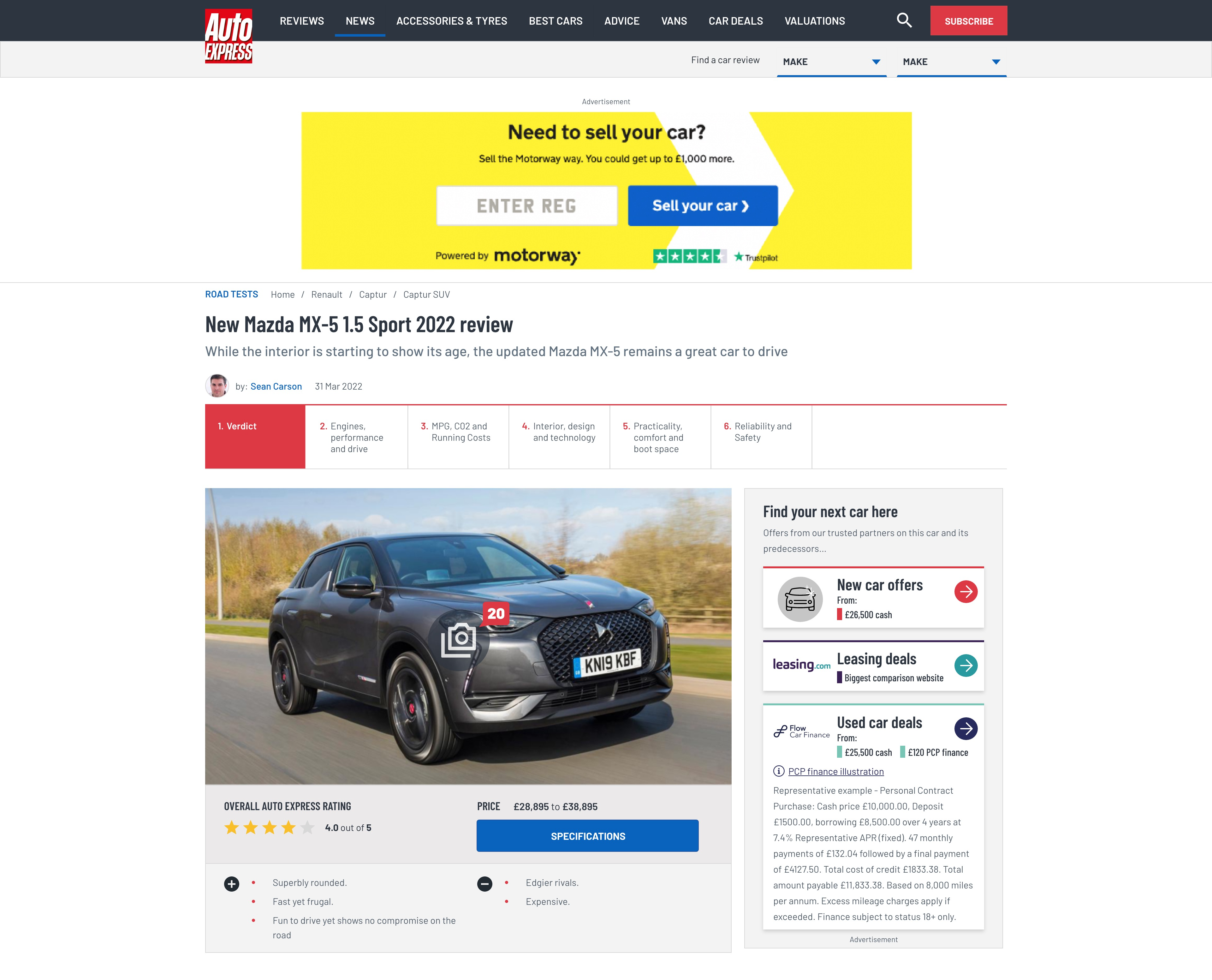
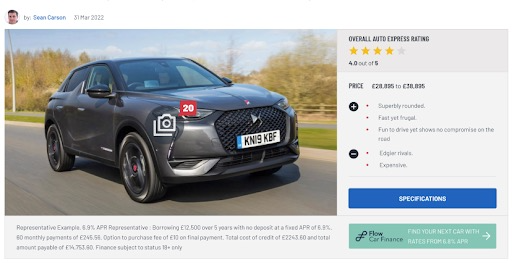
This involved some major structural changes to our review pages - The report card containing our star rating, specifications CTA and the Pro’s and Con’s was moved below our header image. This made the most sense contextually, as all review content was central on the page, stacked vertically, and any long disclaimer text we legally had to display (for example the representative example copy shown in the image above) would not push the contents of the review down the page.
One of the A/B tests we conducted was on whether flat messaging was indeed less appealing to users compared to live pricing. Including live pricing in our individual buy box containers would have used a lot of development resources, so it was important to test both fairly.


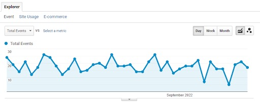
We used our used car partner, Flow Finance, to test a “Hero Button” with flat messaging on some review pages, and a standard buy box that featured a cash price and a PCP finance price. Our Flow Finance hero button generated 617 unique events across 6 weeks, whereas the buy box generated 1200 in just 2 weeks! The hero button had an average of 20 clicks per day, whereas the buy box gave Flow Finance 130 per day.
In 2 weeks the Buy Box had reached 1200 unique events with an average CTR of 0.66% just for Flow Finance, our partner in the used car container. The total CTR for all buttons was at a stellar 2.32%, exhibiting strong interest in the offerings from our partners across the board. Split of 40% for new, 30% for leasing, 30% for used. In terms of the contrast between the sticky CTA’s and the Buy Box, the sticky CTA’s drove a 1.5% CTR, versus 2.32% for Buy Box. It also gave us fantastic market indicators, as we were able to assess consumer trends for each vehicle brand. In the first three weeks, Skoda was in the lead with the highest CTR’s and strong traffic metrics.


So what comes next? Due to the results of the A/B test on flat messaging versus live pricing, we felt confident in adding live pricing to our new and leasing containers to drive high quality traffic in equally high quantities.